


Palm Mobile App
Palm is a scroll-style Bible study and apologetics app designed to make complex theological research easier to explore. I owned the entire product lifecycle from initial concept and UX strategy through interface design, development, testing, and App Store deployment in under one month.

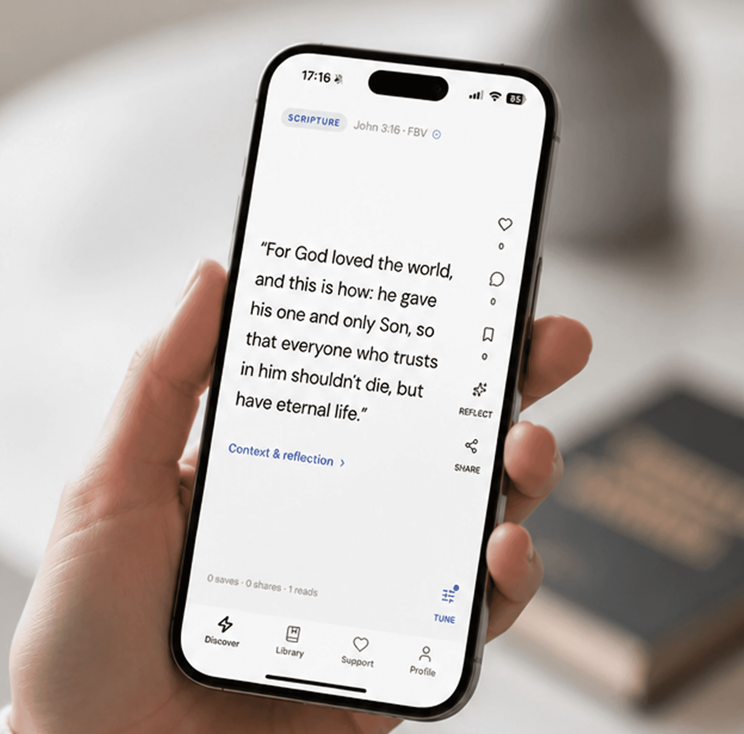

Nashville, TN
2026
Design to Deployment
iOS
1

Challenge
How might we make complex apologetics accessible without making it shallow?
The challenge wasn't simply presenting more information. It was creating an experience that balanced depth, clarity, discovery, trust, and speed. Palm needed to give users enough context to genuinely understand complex theological questions while making the information approachable and easy to navigate. The experience also needed to encourage natural exploration between related questions, present Scripture and supporting evidence in a credible and transparent way, and deliver meaningful answers without forcing users through a complicated research workflow.
Results
Took Palm from an initial concept to a production iOS application and App Store deployment in under one month.
Achieved 100+ downloads in the first two weeks.
100+
App Store Downloads
5 Star
User Review Rate
100%
Reported using Palm as a better study alternative


Process
Research & Analysis: I researched existing Bible study, apologetics, education, and content-discovery experiences to understand how users currently find, evaluate, and navigate complex theological information. I focused on identifying opportunities to reduce friction while preserving depth and credibility.
Information Architecture: I structured Palm around a connected content model linking questions, Scripture, explanations, evidence, and related topics. This created a more exploratory experience where users could naturally move deeper into a subject rather than repeatedly starting new searches.
Wireframing & Prototyping: I translated the core information architecture into low-fidelity wireframes and interactive prototypes, testing different approaches to navigation, content hierarchy, and the scroll-based reading experience. Iterations focused on making dense information feel intuitive and digestible on mobile.
Usability Testing: I tested early prototypes to identify friction in navigation, comprehension, and content discovery. Feedback helped refine the hierarchy, interaction patterns, and pacing of information before moving into high-fidelity design.
Visual Design & Style Guide: I developed a cohesive visual system covering typography, spacing, color, content cards, navigation, and reusable interface components. The visual language was intentionally clean and approachable, creating a modern product experience without making the subject matter feel overly simplified.










“I like that it doesn't feel like I'm reading through a textbook. I can start with one question, keep scrolling, and actually find myself wanting to learn about the next topic.”

Mary Williams
Palm Mobile App User


Conclusion
The process helped transform Palm from a broad concept into a focused product experience built around discovery and deeper study. By combining structured information architecture, iterative prototyping, usability feedback, and a cohesive visual system, I was able to create an experience that makes complex content easier to navigate without stripping away its depth.

